User Interface
This page gives a quick map of the PhotoCuller workspace so you can understand where to look first in the macOS app.
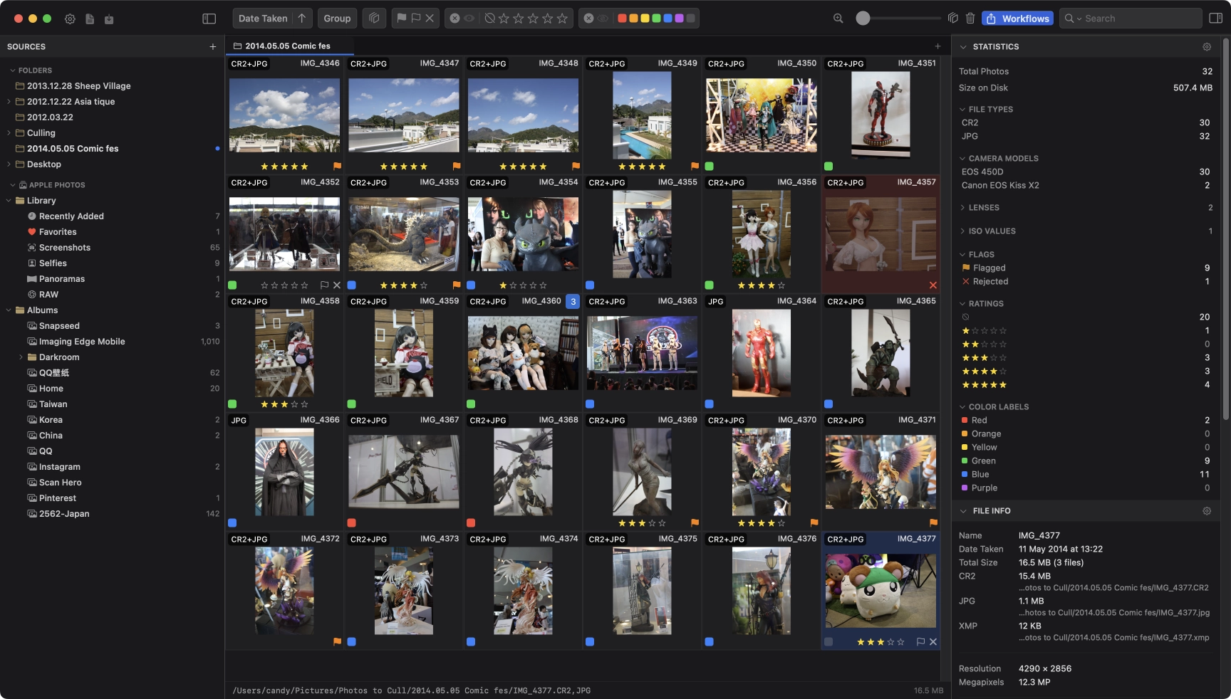
Sidebar
The sidebar is your source browser. Its source sections include:
- Folders - bookmarked filesystem folders, including accessible mounted shares
- Volumes - removable and external drives, including SD cards and camera media
- Network Locations - saved SMB shares; this is not an AFP/NFS connection manager
- Remote Servers - saved FTP / explicit-FTPS connections, separate from mounted folders
- Devices - supported connected cameras
- Apple Photos - your Photos library albums, once access is granted
Use it first in every session, then return to it whenever you need to switch sources or open another source in a new tab.
Tabs
The tab bar sits between the toolbar and the browser area. Each tab is an independent workspace with its own source and scroll position.
Use tabs to keep different folders, albums, or jobs open. Right-click a tab for Reload Tab or Close Tab. Tab titles come from their sources; tabs cannot be renamed or duplicated. See Sources, Sidebar, and Tabs for opening and switching tabs.
Toolbar
The toolbar spans the top of the main content area and is divided into three zones.
Left Side
Fixed above the sidebar, left to right:
- Settings (gear icon) - opens the Settings window. Also accessible via Cmd + ,
- IPTC Templates - opens the IPTC Template manager. Also accessible via Cmd + Shift + T
- Ingest - opens the Ingest window. Dimmed while an ingest is in progress. Also accessible via Cmd + Shift + I
- Workflows - opens the Workflows editor. Also accessible via Cmd + Option + E
- Toggle Sidebar (rightmost, at the boundary between sidebar and main content) - shows or hides the left sidebar
Middle
The filter and sort zone, left to right:
- Sort - sort field (date taken, filename, rating, file size, camera model, and more) and ascending/descending order
- Group By - group photos by capture time, Similar Scenes, stack, camera, lens, ISO, or location. Similar Scenes is available for filesystem-backed sources only. Group By is disabled in List View
- Stack filter - show all photos or stacked items only (visible when stacking is enabled)
- Flag filter - all, flagged only, unflagged only, rejected only
- Rating filter - multi-select star buttons; toggle between include and exclude mode
- Color label filter - one or more labels; toggle between include and exclude mode
- Filter Preset picker - apply a saved filter preset; when active, manual filter controls are disabled until the preset is cleared
- Clear - removes all active filters; only appears when at least one filter is active
Right Side
Left to right:
- Grid View / List View - switch the active tab between thumbnails and a metadata table
- Loupe - toggle the magnifier in Grid View. Also accessible via Z
- Grid size slider - drag to adjust thumbnail size; disabled in List View
- Auto Stack - opens the auto-stack popover to group photos by capture-time gap across the whole collection; only enabled when sorting by Date Taken
- Trash - opens a popover with delete options:
- Move Selected to Trash - deletes the current selection
- Move RAW Files to Trash - deletes only the RAW file from selected RAW+JPEG pairs
- Move Processed Files to Trash - deletes only the JPEG/processed file from selected RAW+JPEG pairs
- Delete All Rejected (N) - deletes every rejected photo; shows a live count
- Search bar - inline search with field and match-mode selectors; collapses to a magnifying glass icon when toolbar space is tight. Focus with Cmd + F
- Toggle Right Panel - shows or hides the right metadata/statistics panel
Grid and List Area
The main browser offers Grid View for visual first-pass culling and List View for configurable metadata columns and inline editing. The screenshot above shows Grid View. Both modes browse the same tab source and use the shared search, filters, selection, and right panel.
List View is flat, including separate rows for stack members; it does not offer grid grouping or manual row arrangement. Column pencils mark supported edits. Status controls can affect multiple selected rows, whereas text/date edits affect one row. Read the List View guide before editing or starting bulk actions.
Optional image numbers can be shown on grid cells for proofing or client-selection workflows.
Right Panel
The right panel has five sections, from top to bottom:
- Workflows - run a saved workflow against the active tab, enter session variables, watch inline progress, or open the full editor. Item filtering is configured in the saved graph; save editor changes before running.
- Statistics - live counts by file type, flag, rating, color label, camera, lens, ISO, and more; click any row to filter the current browser
- File Info - read-only EXIF display for the selected photo
- EXIF Corrections - correct capture date, GPS, and camera metadata for single or multiple items
- IPTC Editor - editorial, rights, contact, and descriptive metadata; switches to the Bulk Editor when multiple items are selected
Menus Worth Knowing
- File - add folders, reload the current source, start ingest, and save or load a selection file
- Tools - open Workflows, Quick Workflow, Client Selection, IPTC Templates, Saved Keywords, Code Replacements, Filter Presets, metadata tools, external editors, and AirDrop sharing
Status Bar
The optional status bar runs along the bottom of the browser and shows:
- Single selection - full file path and file size
- Multiple selected - selection count, total photo count, and combined size of the selection